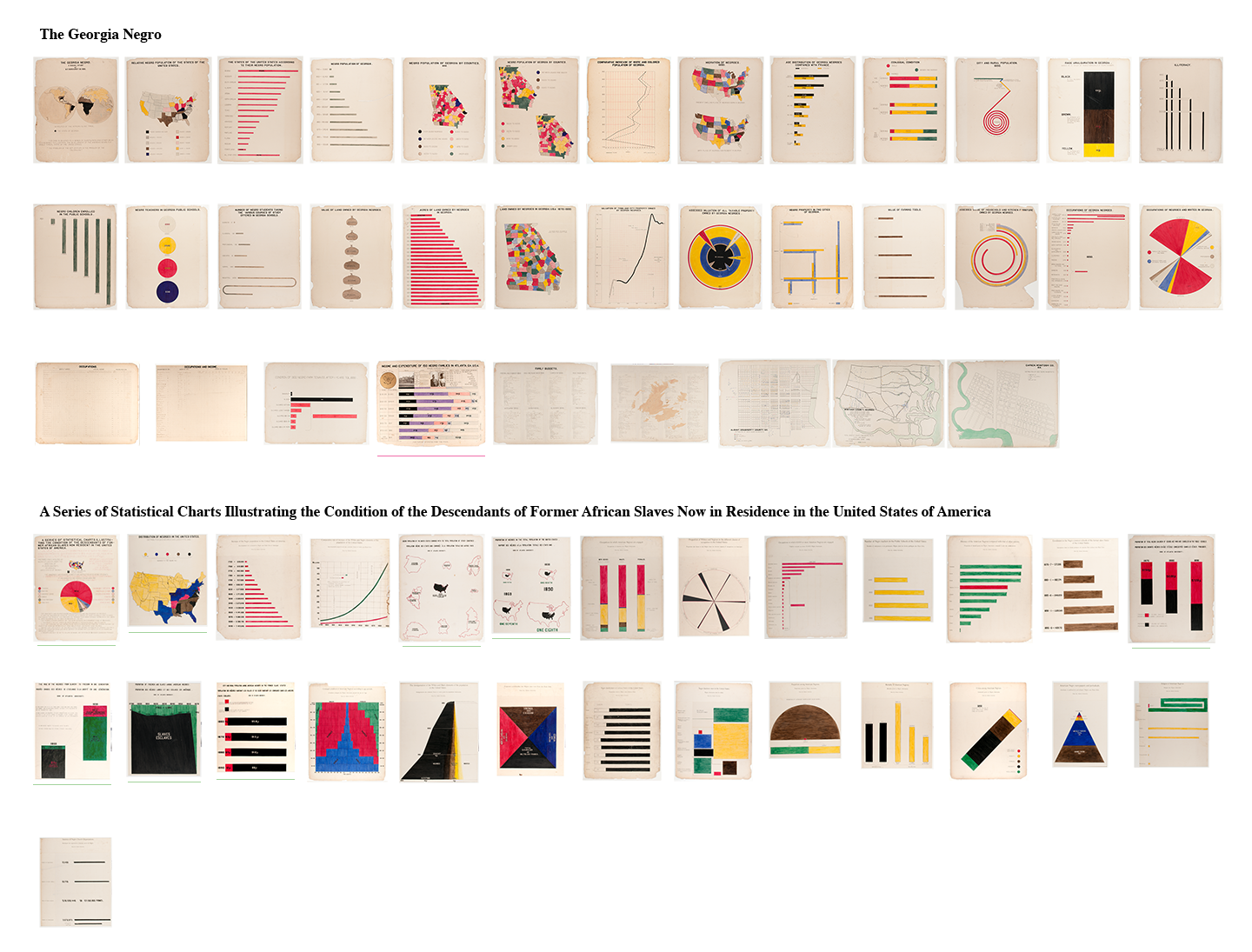
One of the most powerful examples of data visualization was made 119 years ago by an all-black team led by W.E.B. Du Bois only 37 years after the end of slavery in the United States. While Du Bois’ legacy is cemented in American history, his data visualizations remain relatively unknown.
“The Exhibit of American Negroes” at the Exposition Universelle of 1900 in Paris was created by W. E. B. Du Bois, in collaboration with Booker T. Washington, prominent black lawyer Thomas J. Calloway, the assistant librarian at the Library of Congress Daniel Murray, and students from historically black college Atlanta University. Du Bois elaborates, “Thirty-two charts, 500 photographs, and numerous maps and plans form the basis of this exhibit. The charts are in two sets, one illustrating conditions in the entire United States and the other conditions in the typical State of Georgia”.
In the six-part series, I discuss many aspects of this amazing body of work from a data visualization standpoint.
An introduction to the 1900 Paris Exposition which discusses a few notable charts that focus on history and population growth.
Places this body of work within Du Bois’ larger sociological focus and continues the exploration of many of the charts from the exposition with a focus on education, literacy, and occupation.
A detailed examination on how Du Bois drafted his charts, a consideration of this work as a precursor to modernism, and the discussion of a series of charts on land ownership and value.
Discoveries on viewing an original chart and further exploration of Du Bois’ more innovative charts dealing with occupation, business, and poverty.
Discusses Du Bois’ body of work from this period and his frustrations with social science despite widespread attention.
To close out the series I present a very exciting discovery: a lost chart from the exhibit, not contained in the Library of Congress. I also spend some time discussing the sequence of the charts and why that matters to the larger series.


